
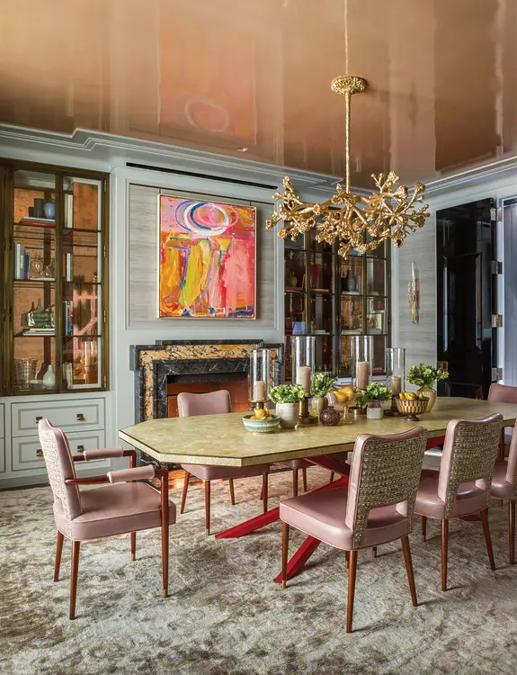
Psychology of colors in interior design: How to choose the perfect color?
Interior design is an art that allows us to visually express our inner world. A home is like a blank canvas, where every color, piece of furniture, and decor becomes a part of our imagination.
Although creativity plays the leading role during apartment renovation, the color palette is of particular importance. Colors directly affect our mood, energy, and productivity. Before you start your renovation and calculate the expenses (which greencolor.ge will help you with), it is important to know what the psychology of colors teaches us.
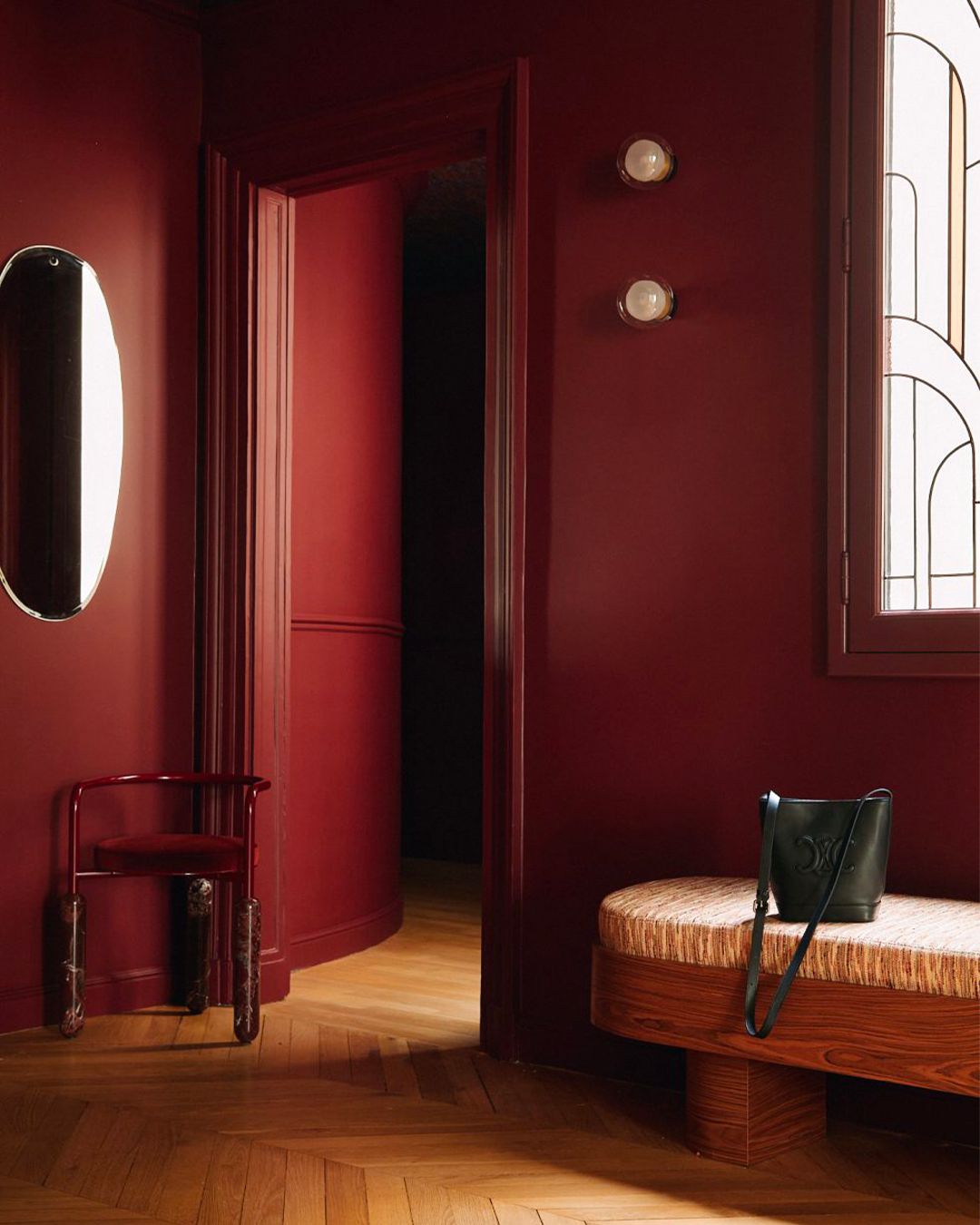
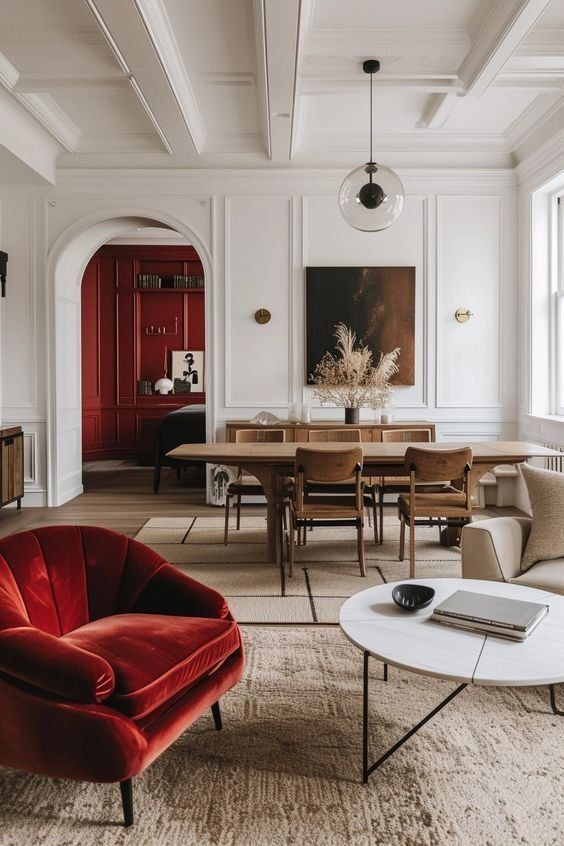
Red in Interior Design
Red is the most powerful and emotional color. It can simultaneously evoke passion, energy, and a feeling of love, but also aggression and tension. In an interior, red is often used in bedrooms because it creates an atmosphere of love and desire. However, if used excessively, it can become overwhelming.
Where to use:
- On accent walls or in textiles (pillows, curtains).
- In dining areas, as red increases appetite.
For the best result, combine red with white or beige to balance the emotions.
Associated emotions: love, passion, energy, courage, leadership, but also anger and revenge..
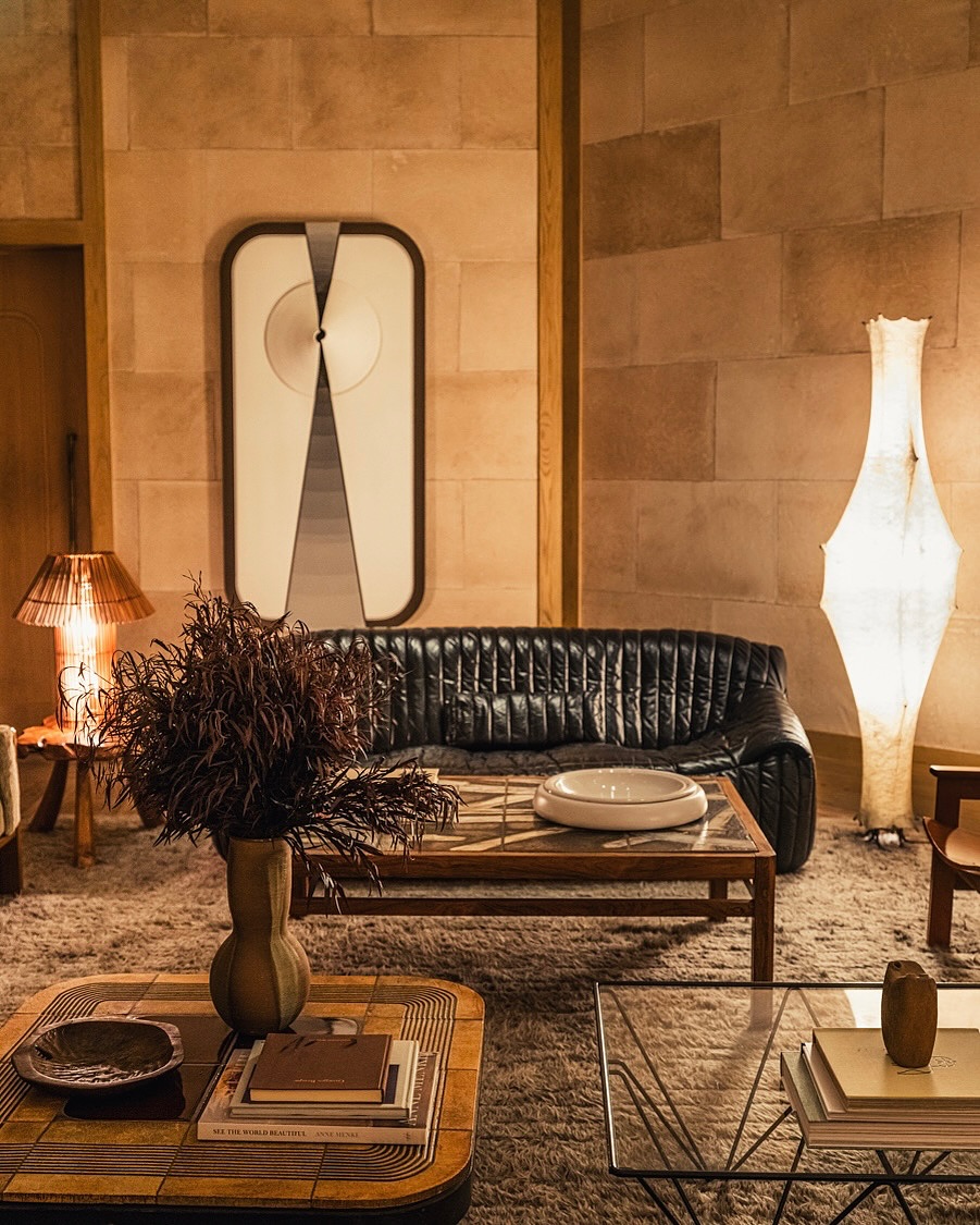
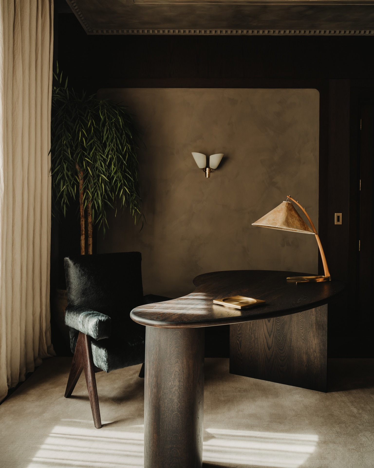
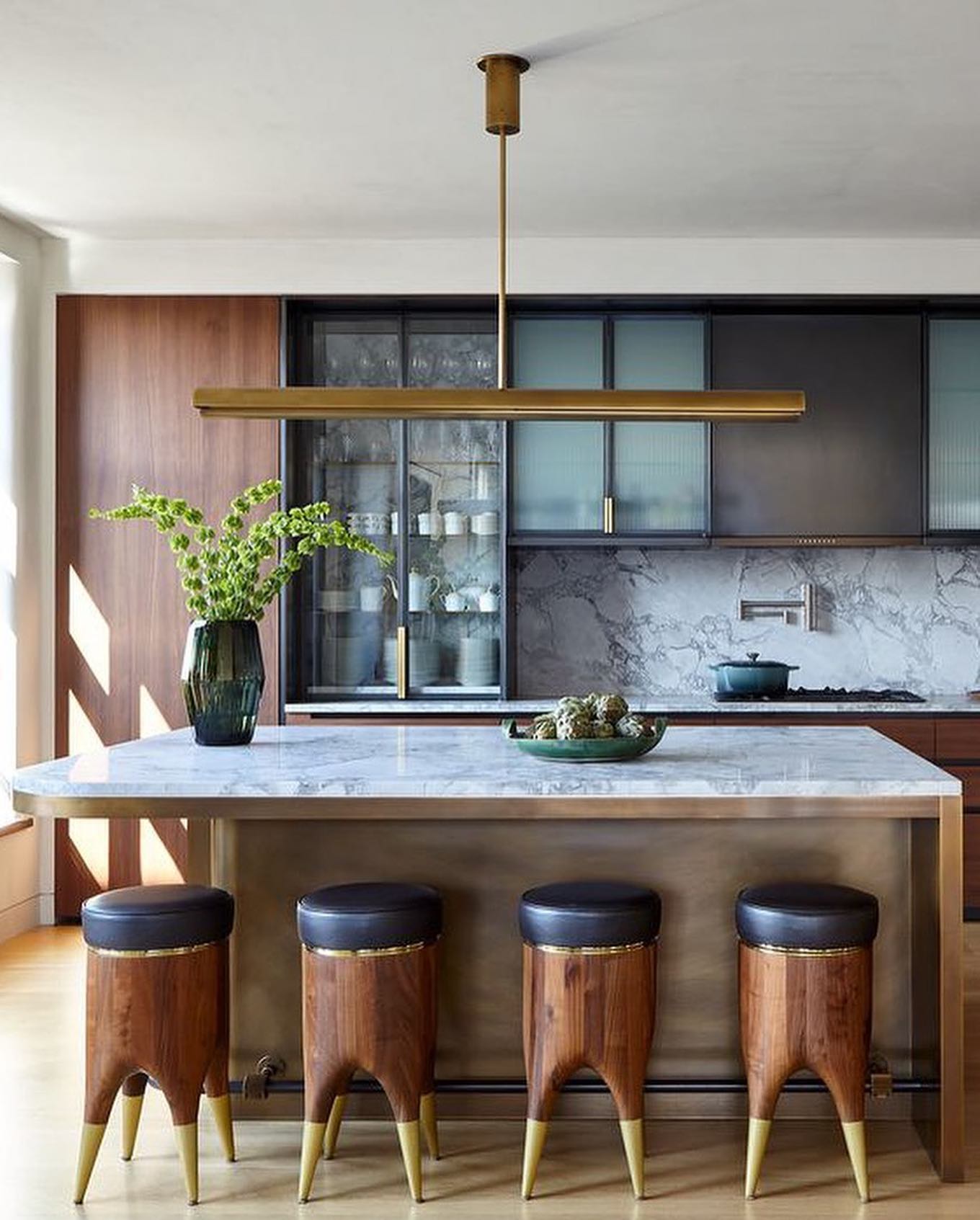
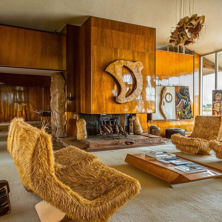
Brown: Coziness and Stability in the Home
Brown is associated with nature and gives us a feeling of warmth, stability, and tranquility. However, its excessive use can cause a feeling of melancholy and sadness.
Where to use:
- In the living room, to create a comfortable and “cozy” environment.
- In the kitchen, in the form of wooden elements.
- It is especially effective in combination with natural materials (wood, stone).
Associated emotions: reliability, firmness, comfort.
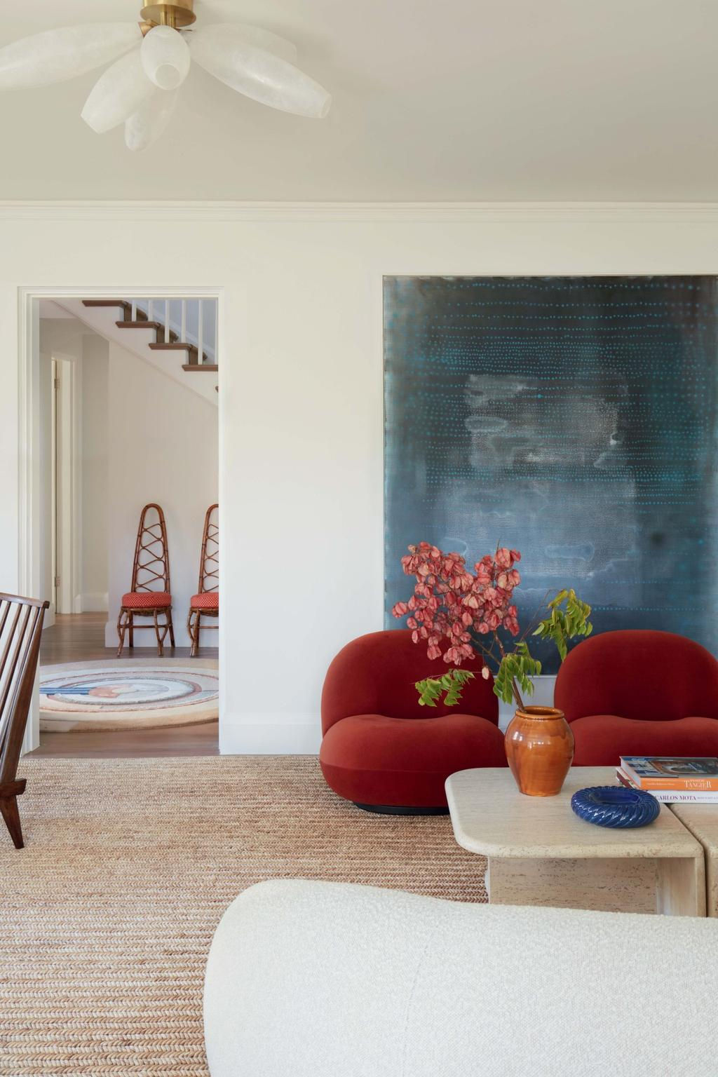
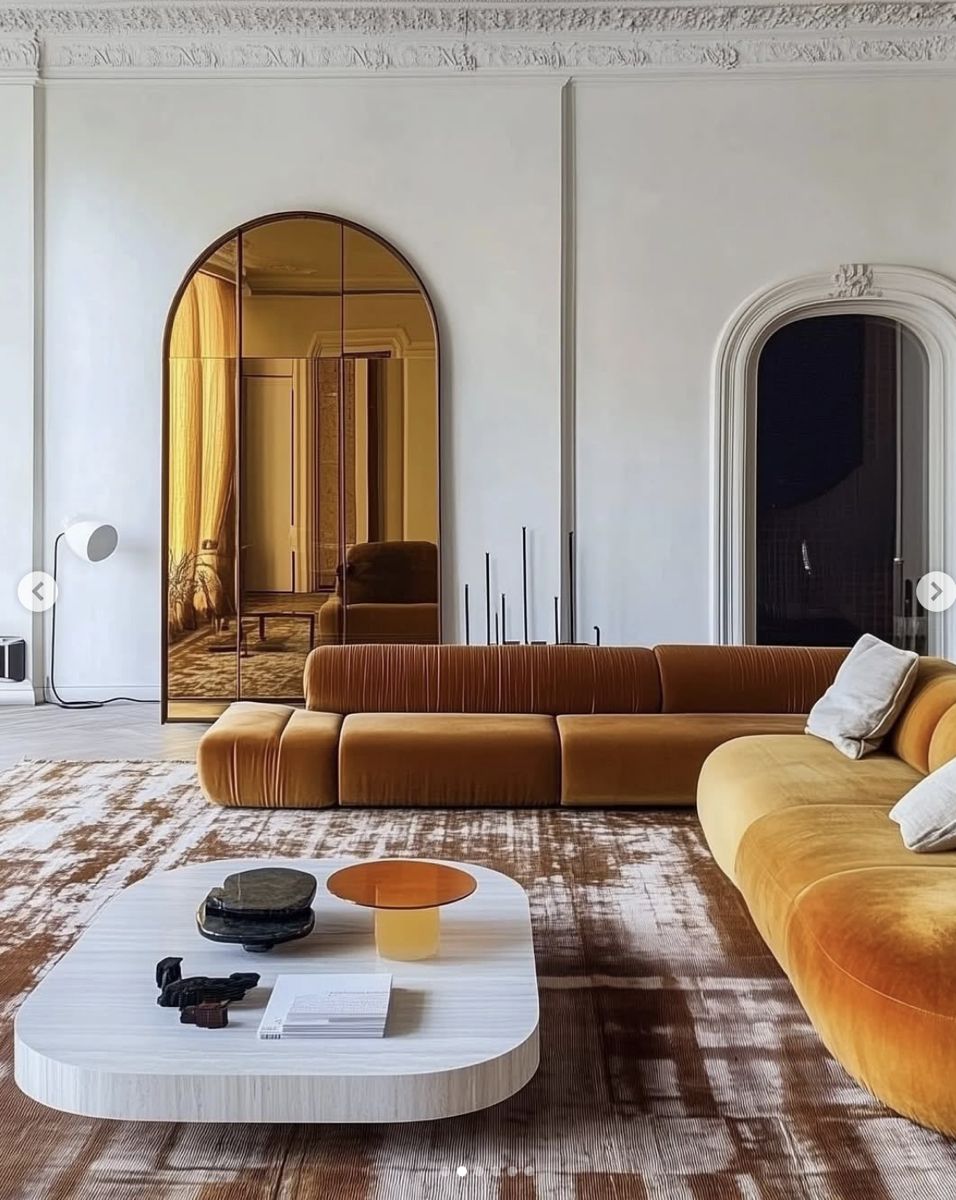
Orange for the Kitchen and Dining Room
Orange is associated with the sun, warmth, and optimism. It creates a cheerful atmosphere, inspires activity, and increases sociability.
Where to use:
- In the kitchen and dining room—orange stimulates the appetite.
- In children’s rooms—it promotes creativity.
- In the living room—to create a welcoming environment.
Associated emotions: happiness, enthusiasm, cheerfulness, positivity.
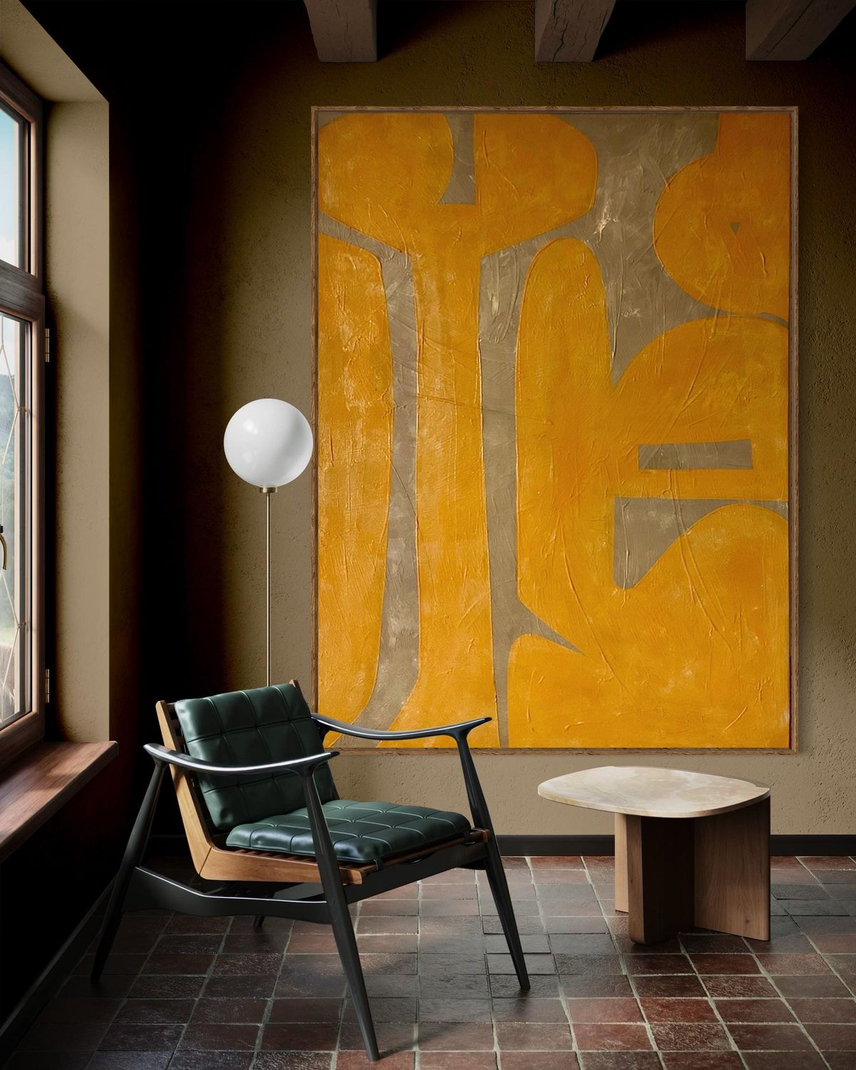
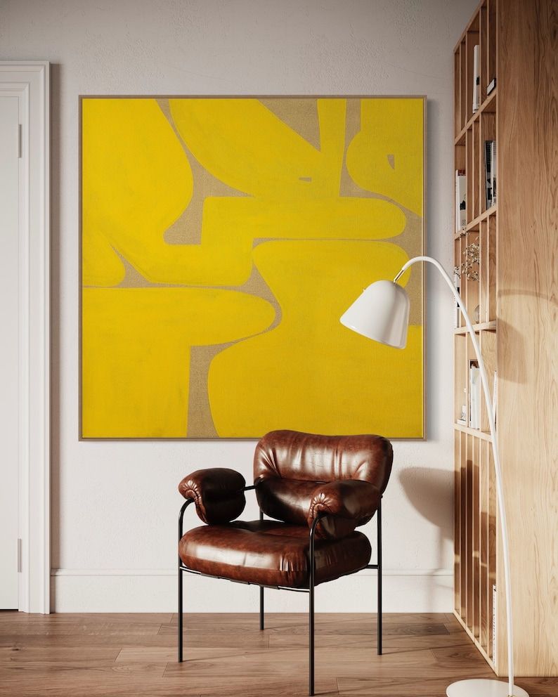
Using Yellow in the Interior
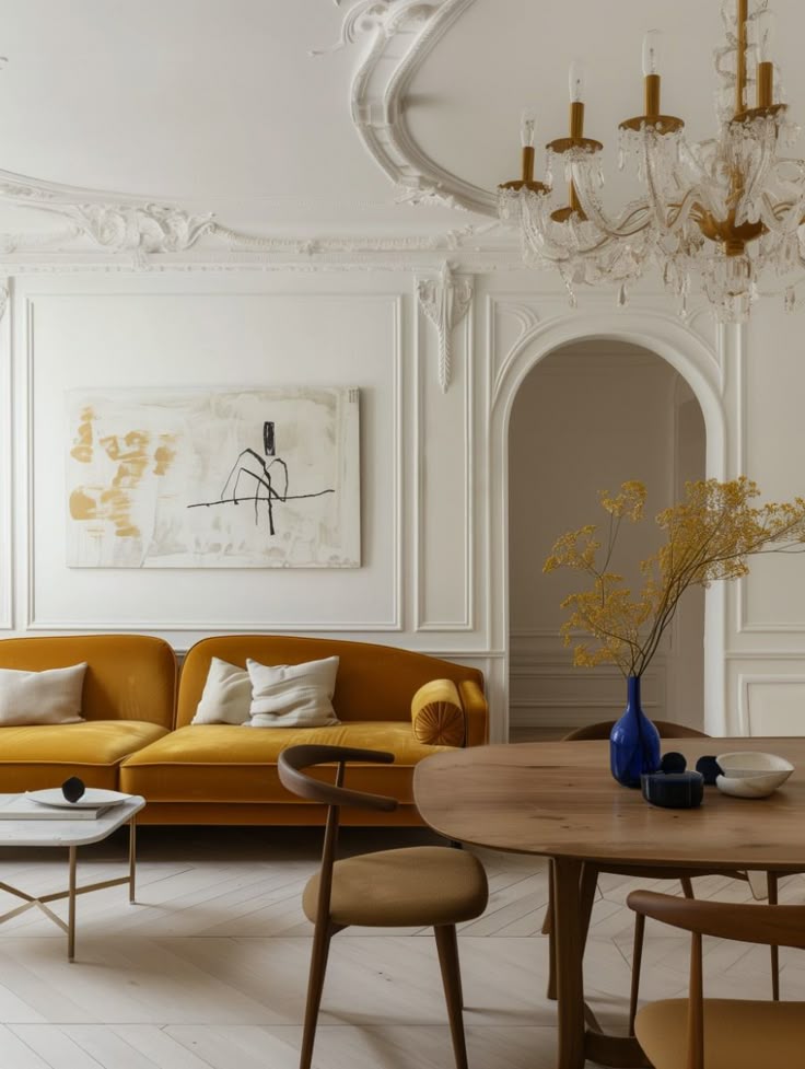
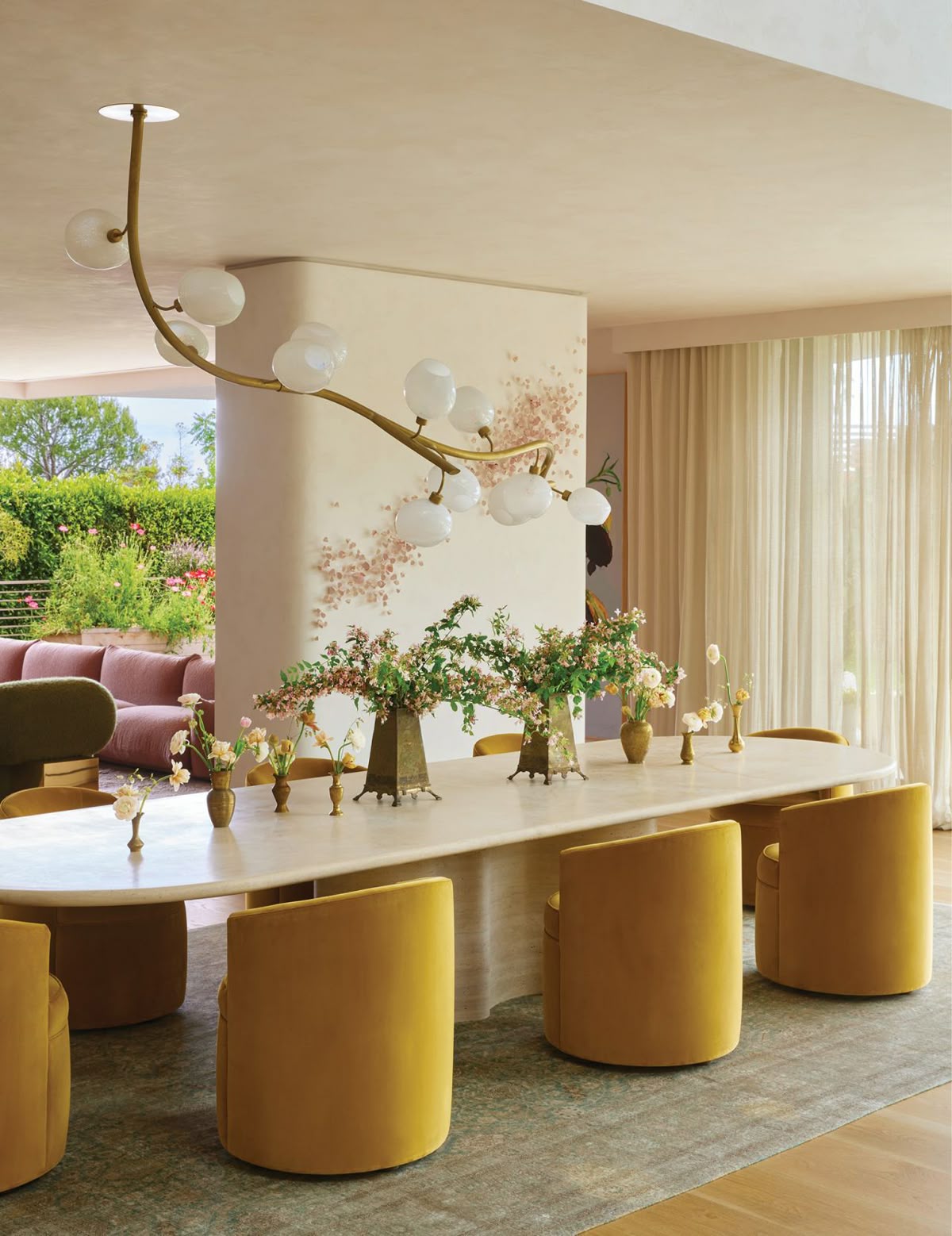
Yellow is the color of sunlight and automatically lifts the mood. It is associated with joy, intellect, and prosperity.
Where to use:
- In hallways and bathrooms—it makes the space brighter.
- In the kitchen and dining room—it adds energy.
- It is preferable to combine it with white or gray to avoid excessive “excitement”.
Associated emotions: joy, optimism, productivity, but when used in excess—agitation and tension.
Green: A Natural Environment in Your Apartment
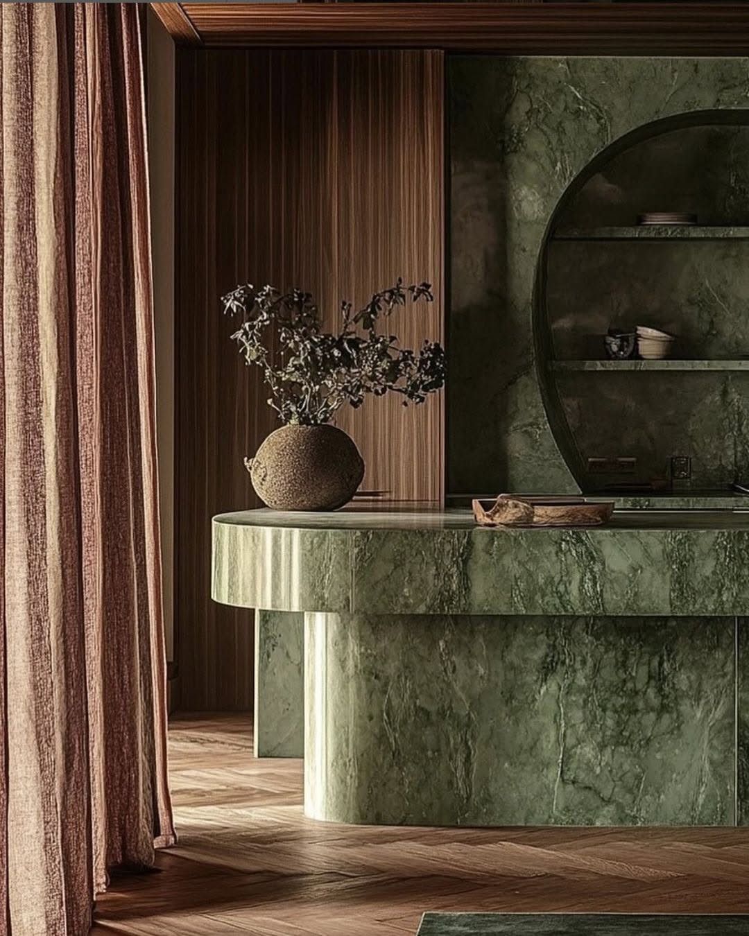
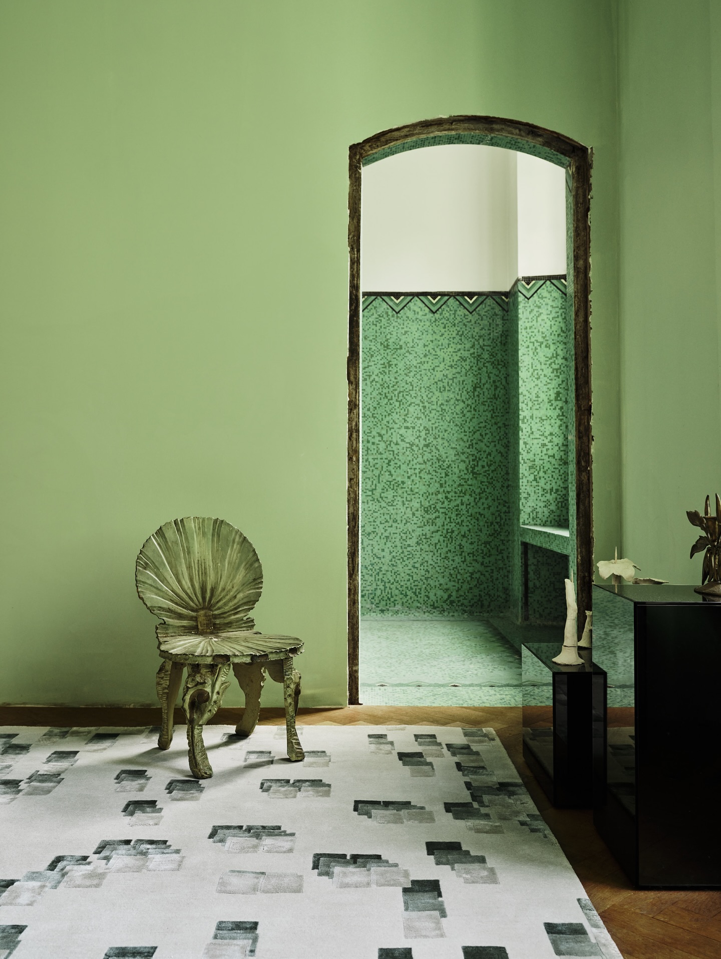
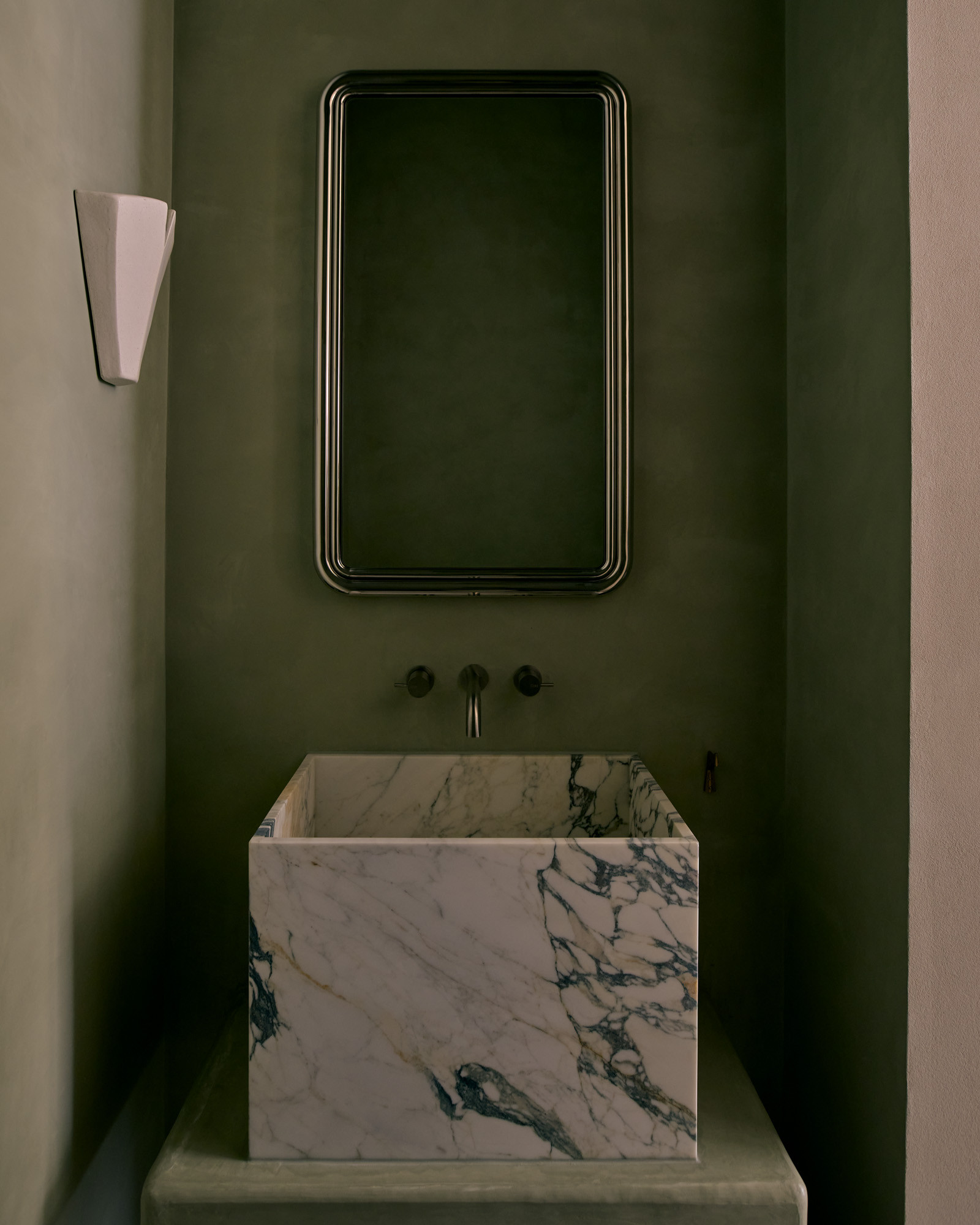
Green is the color of nature. It is associated with tranquility, harmony, and health. Light green reduces stress and is even beneficial for health.
Where to use:
- In the bedroom—for relaxation.
- In the workspace—to increase concentration.
- In the living room—to create a harmonious atmosphere.
Associated emotions: nature, tranquility, trust, fertility, but also greed and jealousy.
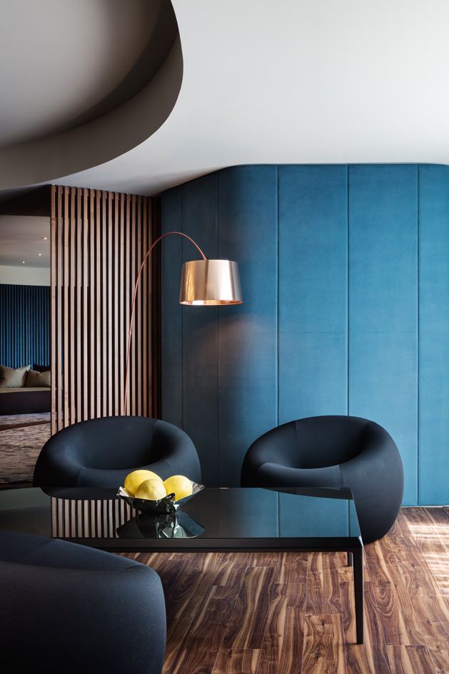
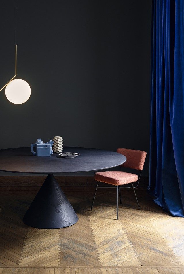
Blue in Bedroom and Bathroom Design
Blue is one of the most calming colors. It calms the mind, reduces stress and hypertension. Light blue is beneficial for bedrooms, while dark blue is a symbol of elegance and luxury.
Where to use:
- In bedrooms—for relaxation.
- In the bathroom—due to its association with the water element.
- In the workspace—to improve concentration.
Associated emotions: tranquility, wisdom, trust, loyalty, elegance.
Purple: How to Create a Luxurious Interior?
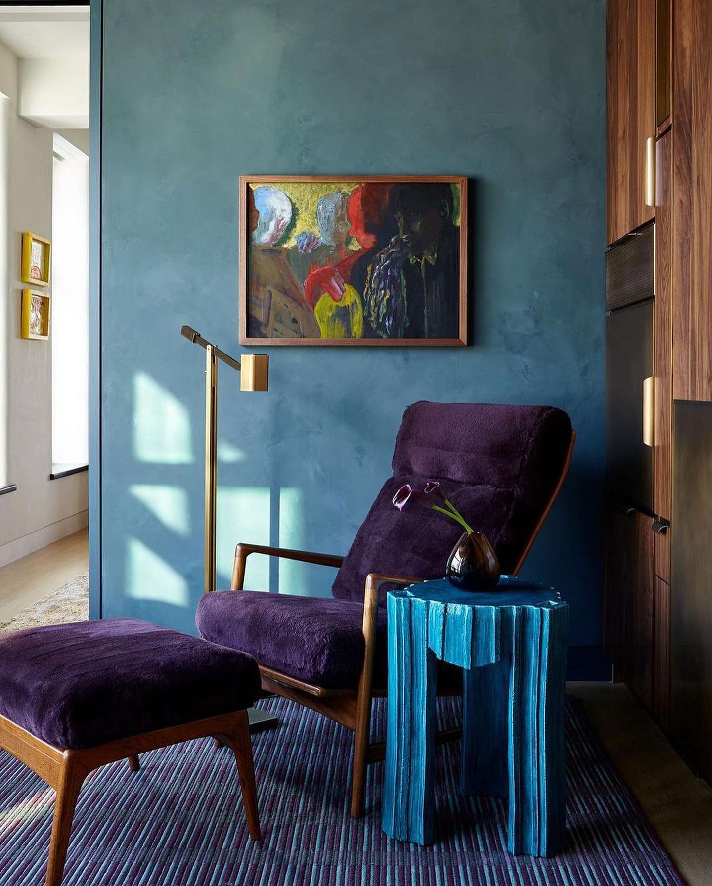
Purple is associated with luxury, mystery, and creativity. It is ideal for those who want to add “drama” and sophistication to the interior.
Where to use:
- In workspace or studio spaces—to increase creativity.
- In the living room—for an elegant atmosphere.
- In children’s and teenagers’ rooms—for creative inspiration.
Associated emotions: luxury, creativity, wealth, drama.
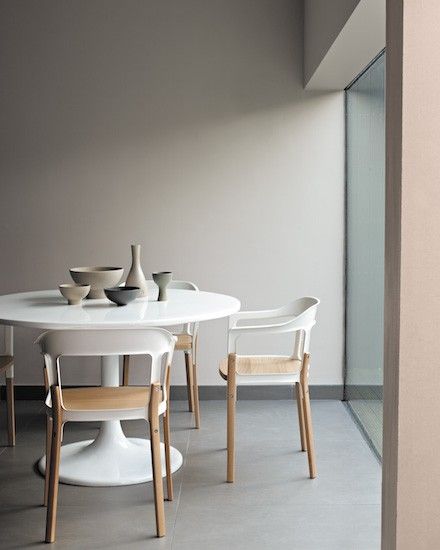

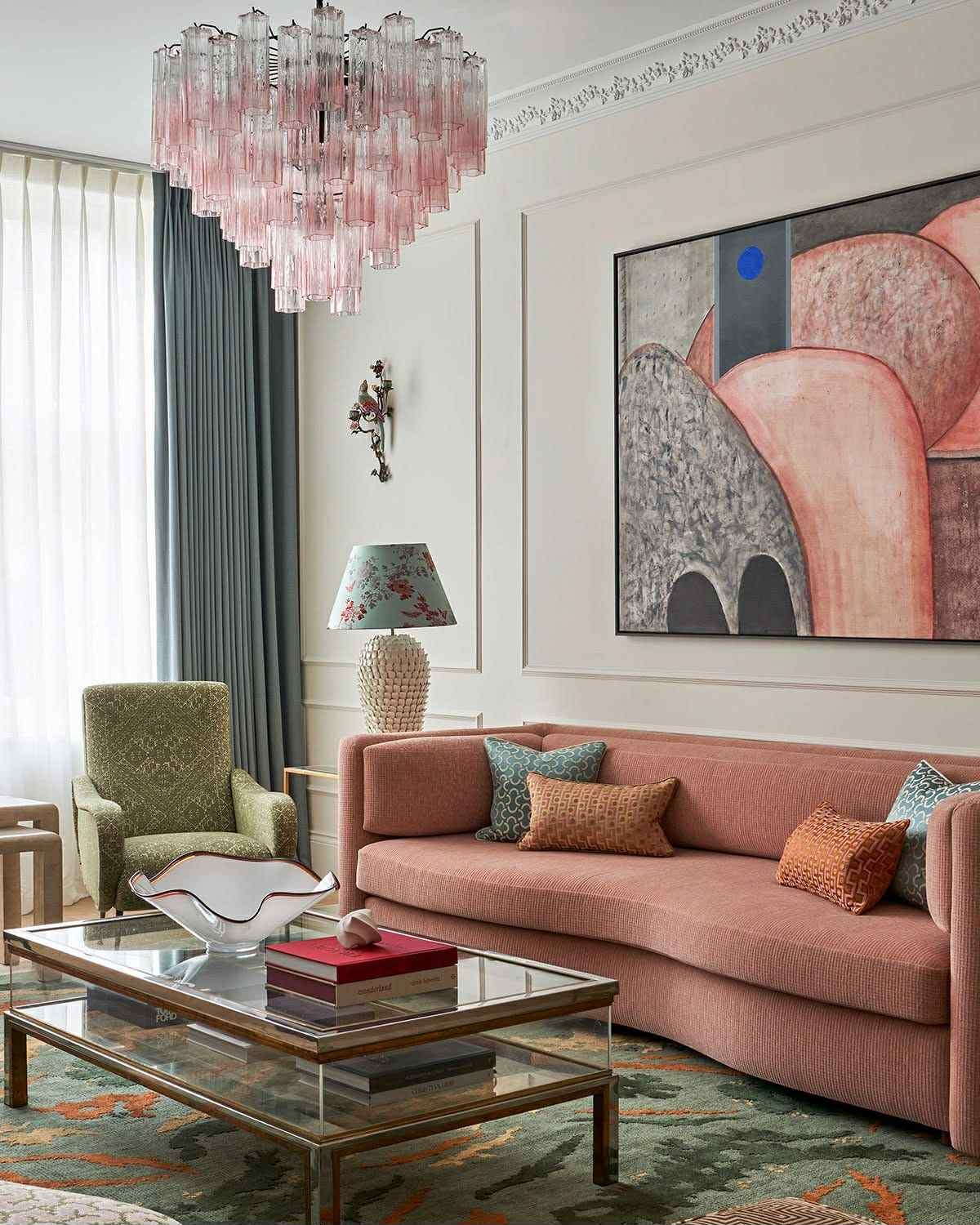
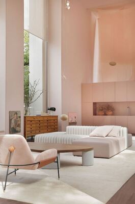
Pink in Modern Renovation
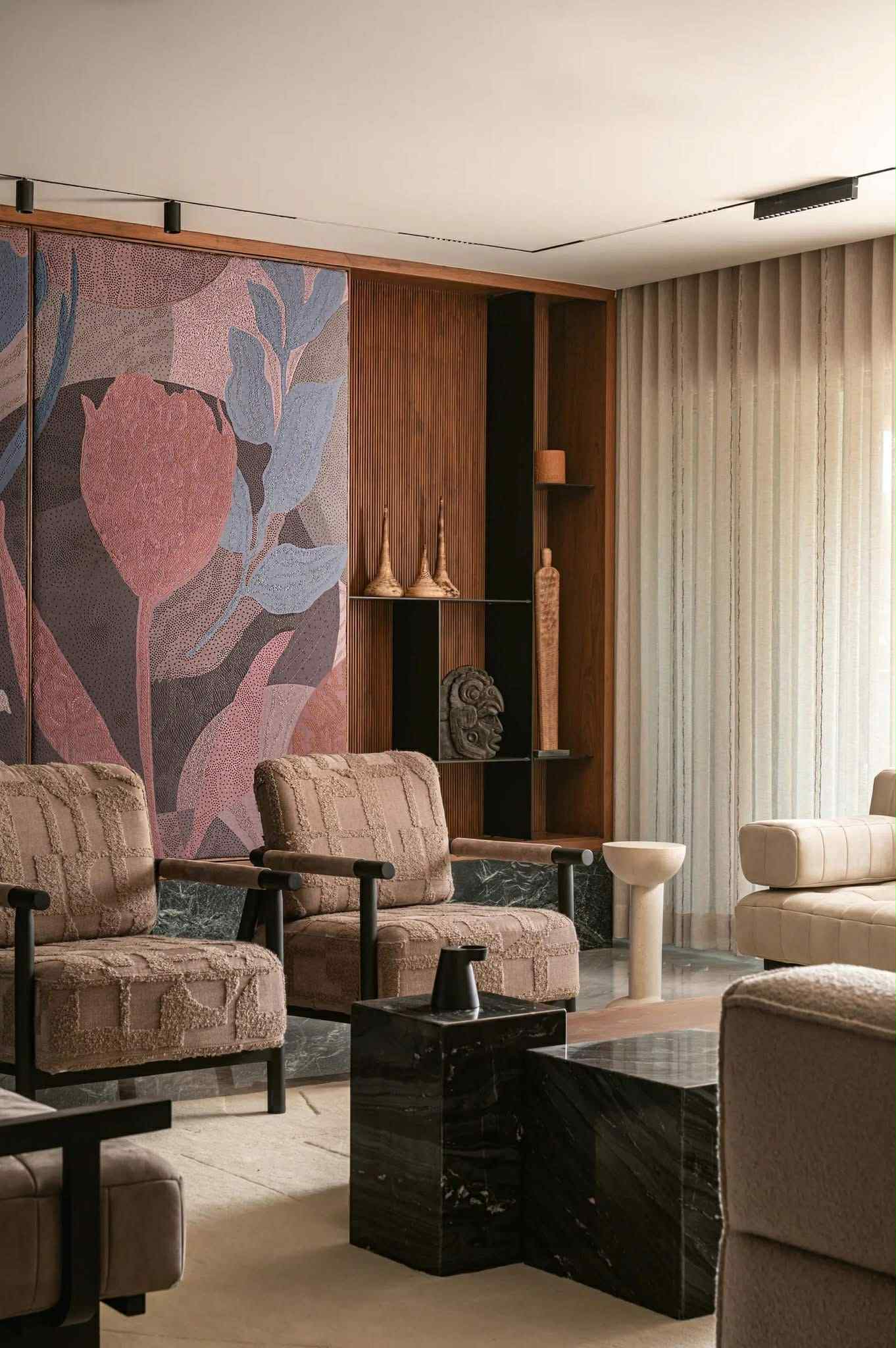
Pink is the color of love, warmth, and compassion. It creates a warm and harmonious atmosphere. Although it is often considered a “feminine” color, when used correctly, it can be quite neutral and elegant.
Where to use:
- In bedrooms—for a romantic mood.
- In children’s rooms—for joy and warmth.
- In the living room—to create a warm and comfortable environment.
Associated emotions: love, compassion, warmth, romance.
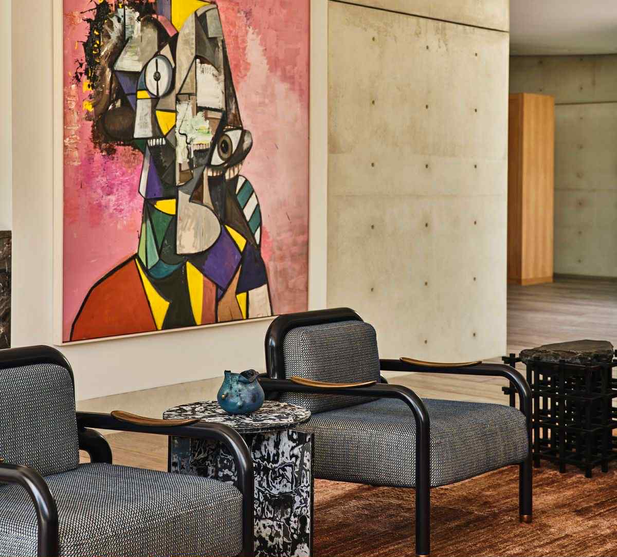
White Walls and Expanding Space
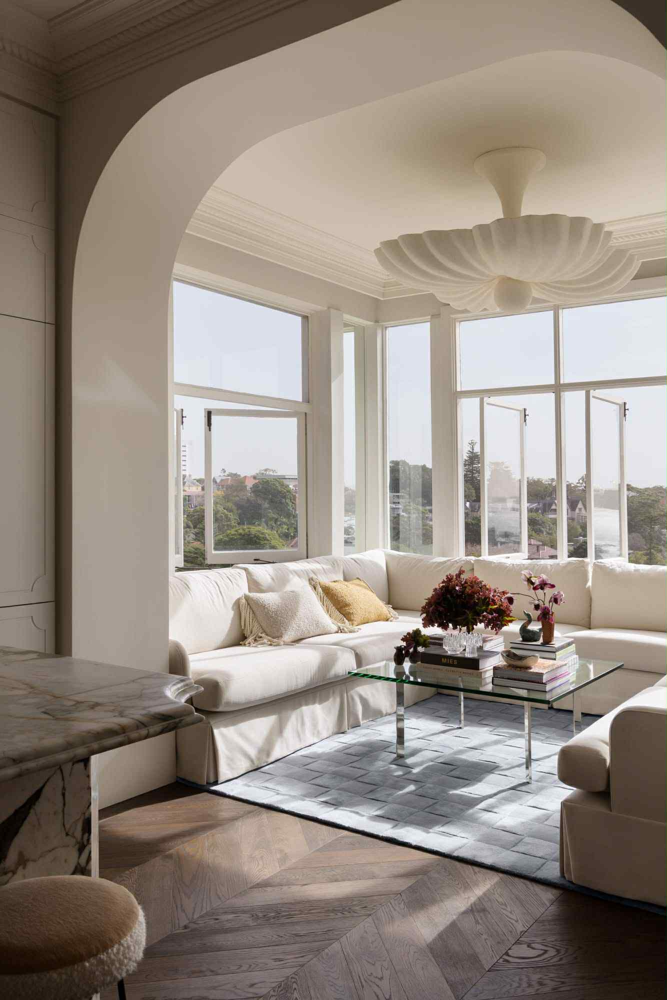
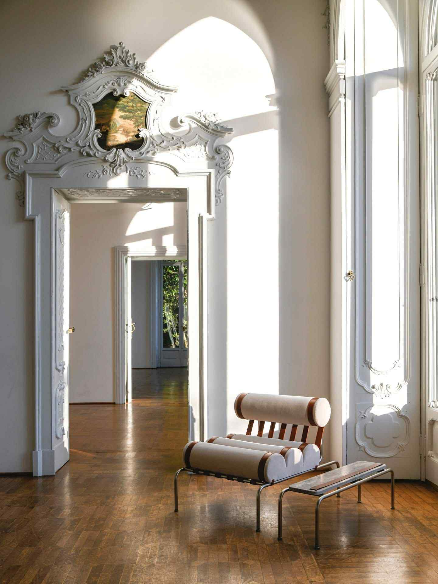
White is a symbol of cleanliness and purity. It visually expands space and is ideal for small rooms.
Where to use:
- On the walls of any room—to enlarge the space.
- In Scandinavian and minimalist interiors.
- It is excellent as a background for accent colors.
Associated emotions: tranquility, cleanliness, freedom, harmony.
Gray Design and Style
Gray is a neutral and elegant color. It works well both on its own and combined with other colors. However, when used excessively, it can have a depressing effect.
Where to use:
- In furniture and textiles—for sophistication.
- On walls—to balance other bright colors.
- In modern, industrial, and minimalist interiors.
Associated emotions: style, elegance, simplicity, but also sadness and austerity.
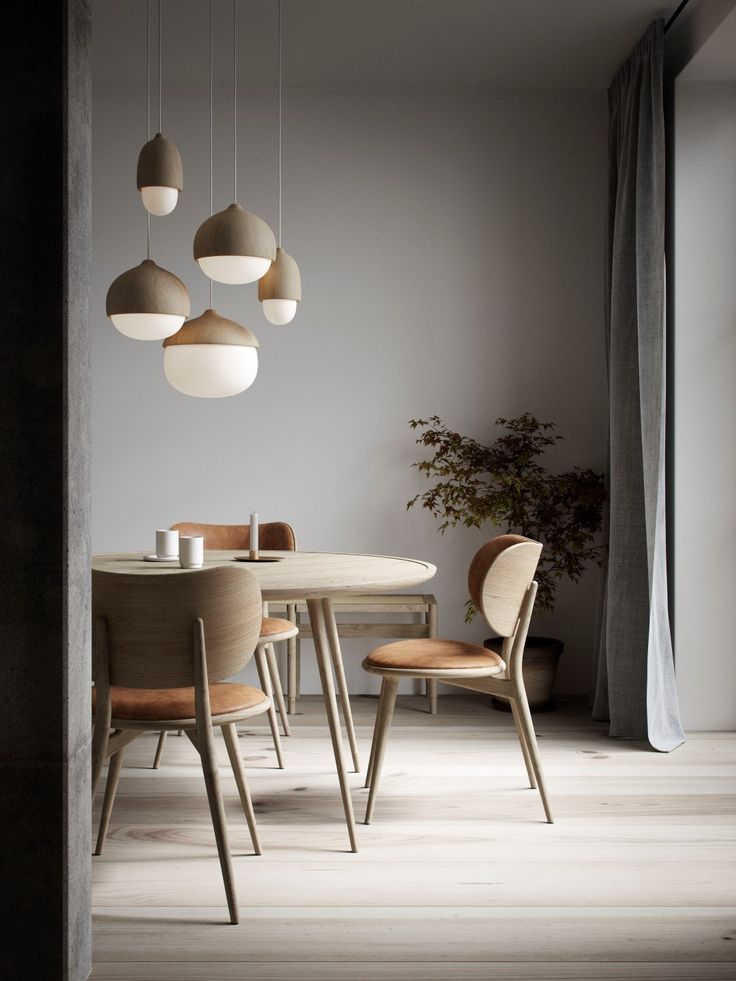
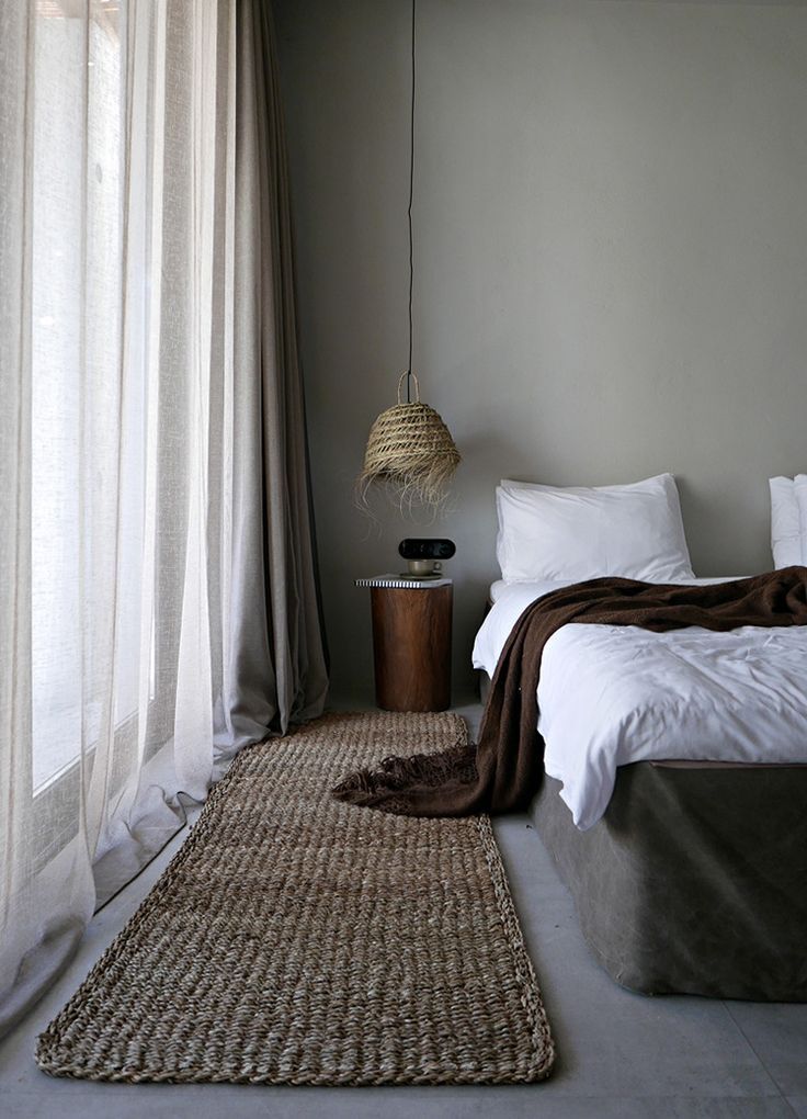
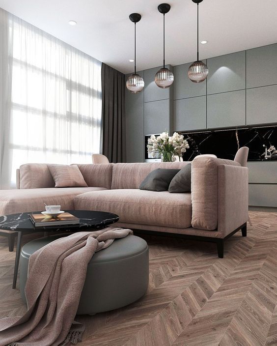
By correctly combining colors, it is possible to create an interior that is not only aesthetically pleasing but also improves our emotional state.
If you have chosen your style, visit our calculator and compute how much your renovation will cost using our renovation calculator.